
MOVIE TICKET BOOKING
Approaching UI/UX with a more open, adaptive, and cross-cultural perspective.
Duration
1 week (February 2025)
Tools
Figma
My role
UI Design, UX Design
Context
As an international student studying in the United States, I am influenced by the cultures of both countries. As a designer, I can also feel the differences in logic and aesthetics between Chinese and American UI/UX design. By analyzing the similarities and differences between movie ticket booking apps from both countries, I aim to find a solution that combines the comprehensive functionality and information of Chinese apps with the clear and easily accesible layout of American apps.
Analysis
User Flow
To create a better user experience, I analyzed the user flow of purchasing movie tickets online. I especially appreciate how Chinese ticketing platforms allow users to access the ticket purchase page from multiple entry points, which creates a smooth and flexible UX flow.

UIUX Analysis

I conducted an analysis of Chinese and American movie ticket booking apps (猫眼,淘票票,AMC, Fandango, IMDb). I looked at how each step is designed, and compared them both across the entire user flow.
My goal was to find a balanced solution that combines the strengths of both cultures in UI/UX design.
I analyzed and summarized the design logic of both UI/UX styles and the user experience they create.
Feature
User Experience (UX)
Visual Design (UI)
Cinema Intergration
Social Features
Chinese Platforms (Maoyan, Taopiaopiao)
Highly streamlined, fewer steps to purchase
Information-dense, busier layout
Unified access to multiple cinema chains
Reviews, ratings, trending movies integrated
American Platforms (AMC, Fandango)
Confirmation process not consistent
Large images, clean but less efficient
Often tied to specific cinema brands
Basic ratings
Design & Prototype
Color


When you hear the words "movie" or "cinema," what colors come to your mind first?
The major movie platforms all use red and yellow color schemes. I interviewed friends from both China and the U.S., and found that these two colors are the ones people most naturally associate with movies and cinemas.
The design colors I chose also fall within these two color schemes.
Default
#F03737
Light
#FFCFCF
Dark
#590F0F
Default
#FFBF00
Light
#FFF6DD
Dark
#FFAA00
Gray 100
#FFFCFC
Gray 200
#F7F7F7
Gray 300
#F0F0F0
Gray 400
#D7D7D7
Gray 500
#BBB9B9
Gray 600
#8F8F8F
Gray 700
#6A6863
Gray 800
#454545
Gray 900
#191917
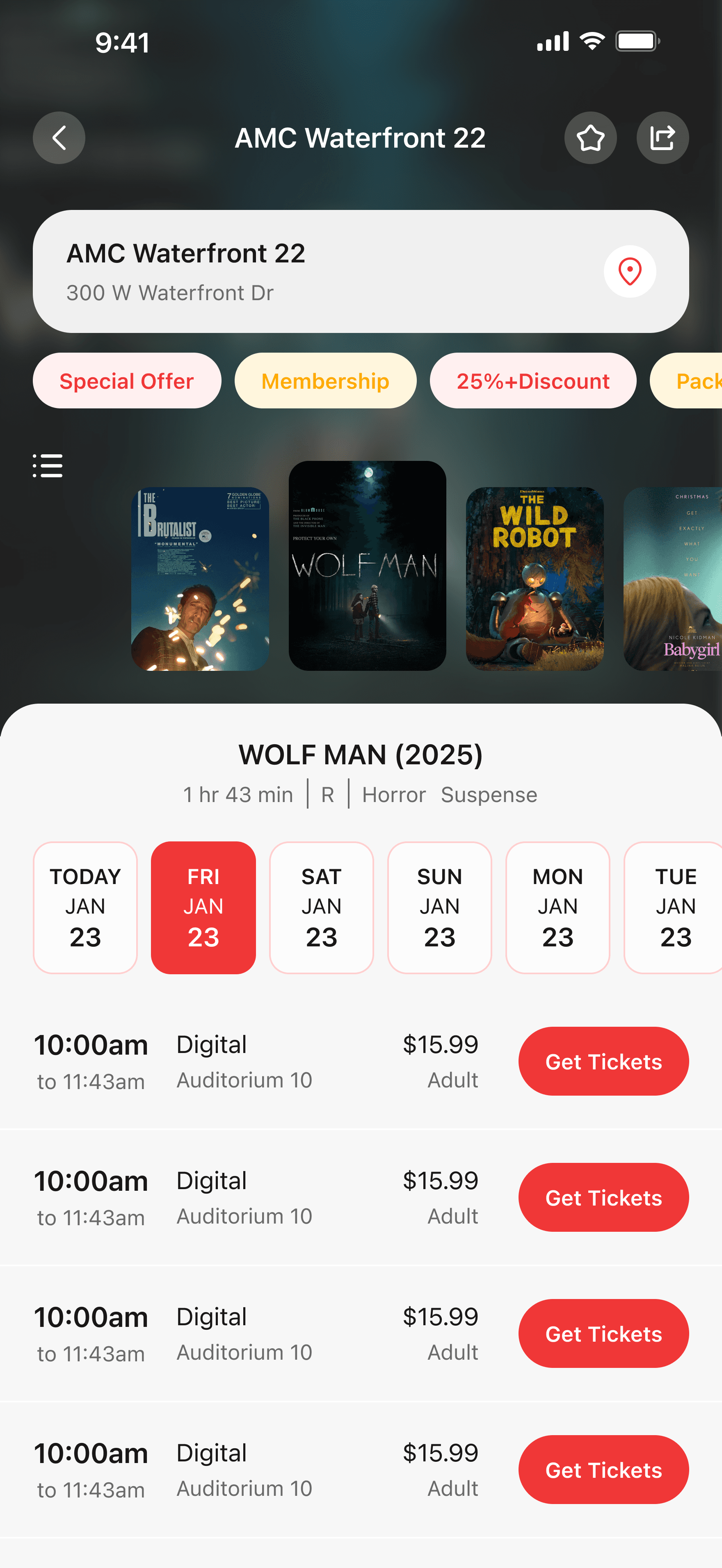
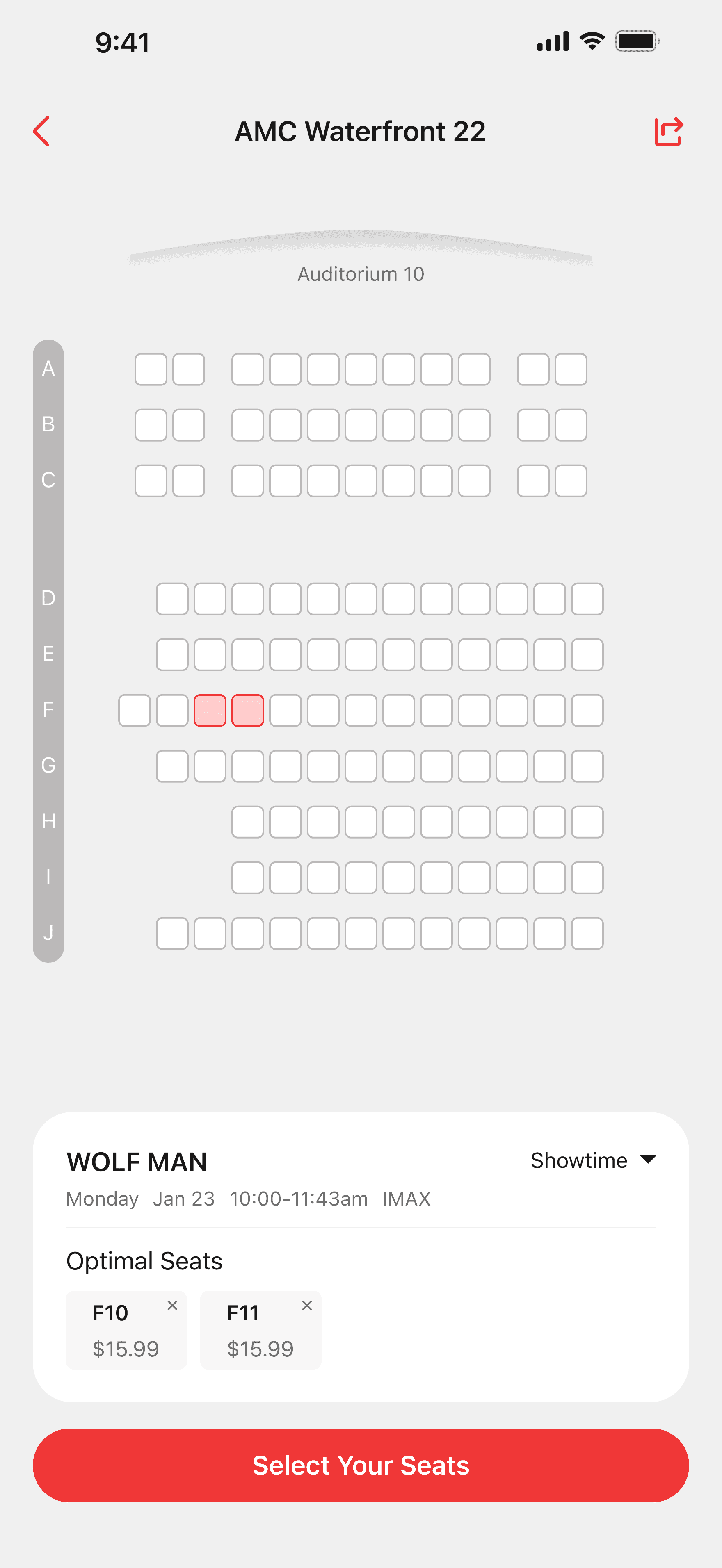
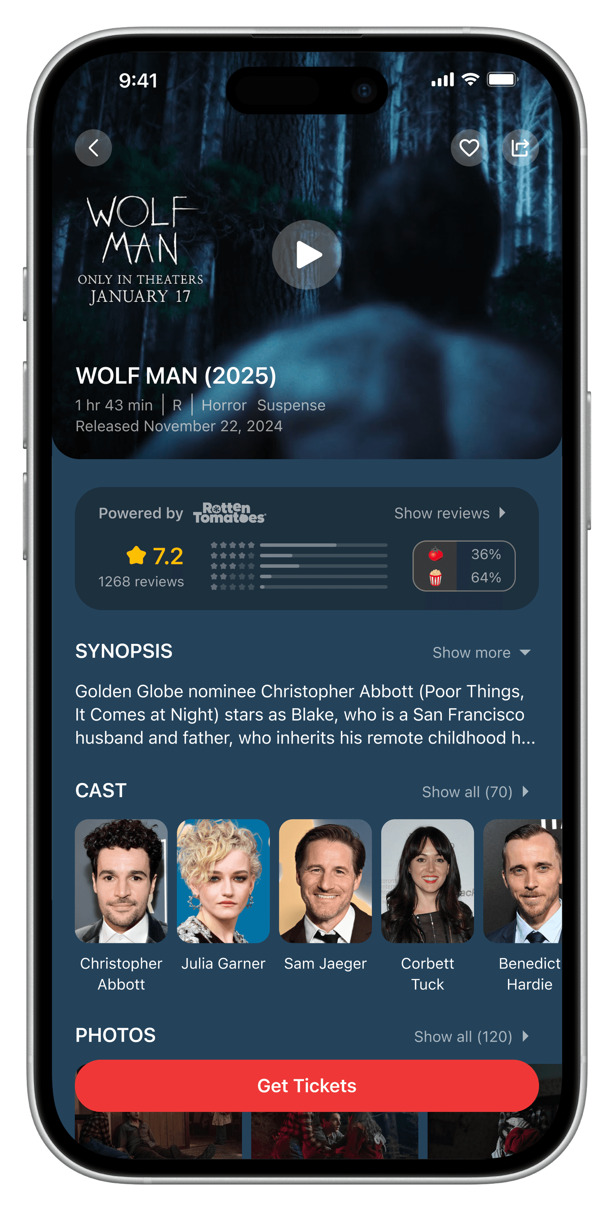
Designing Interface
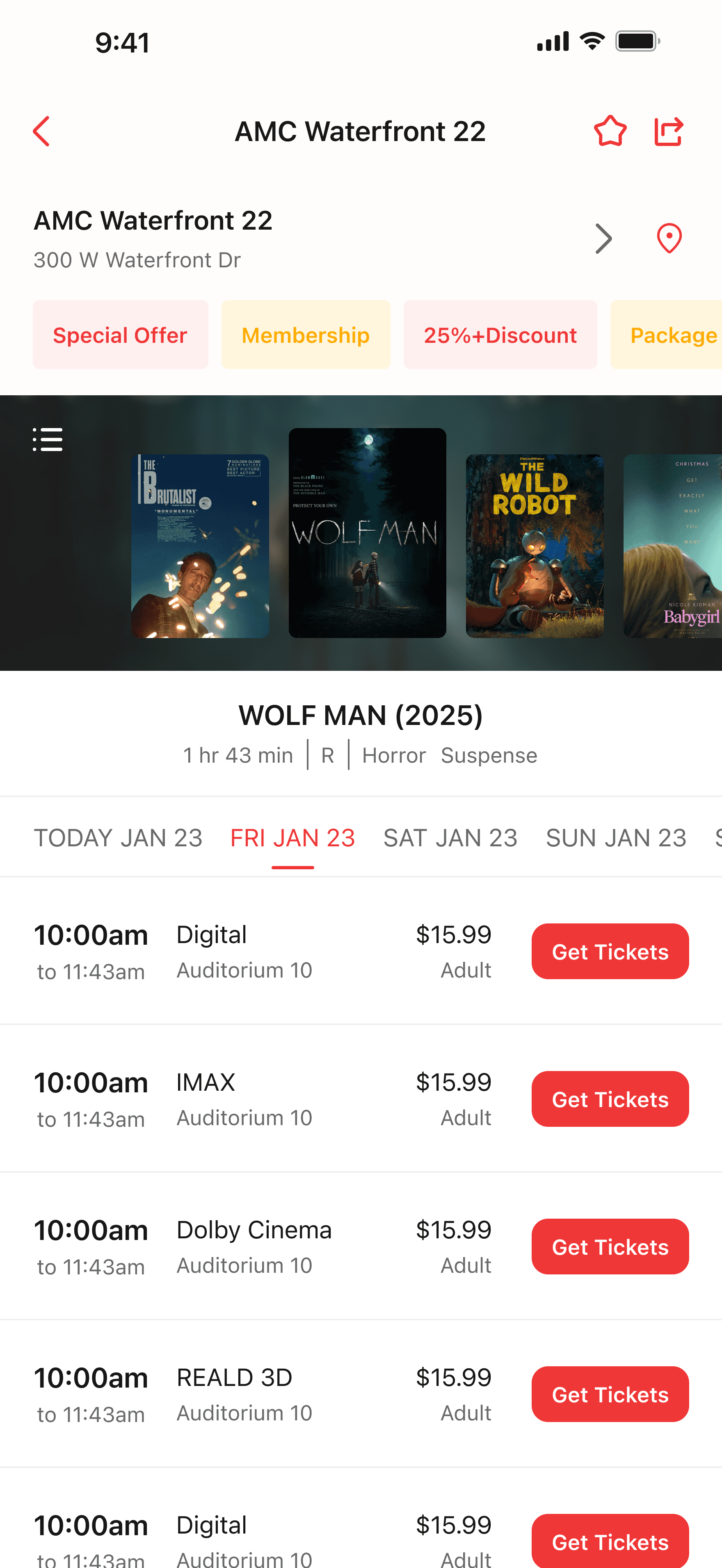
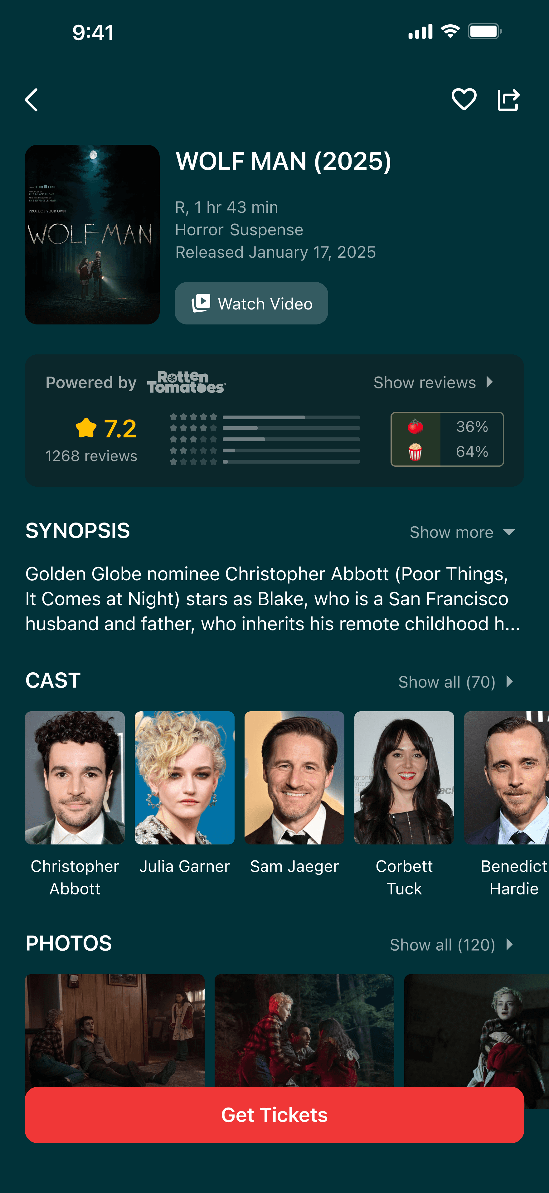
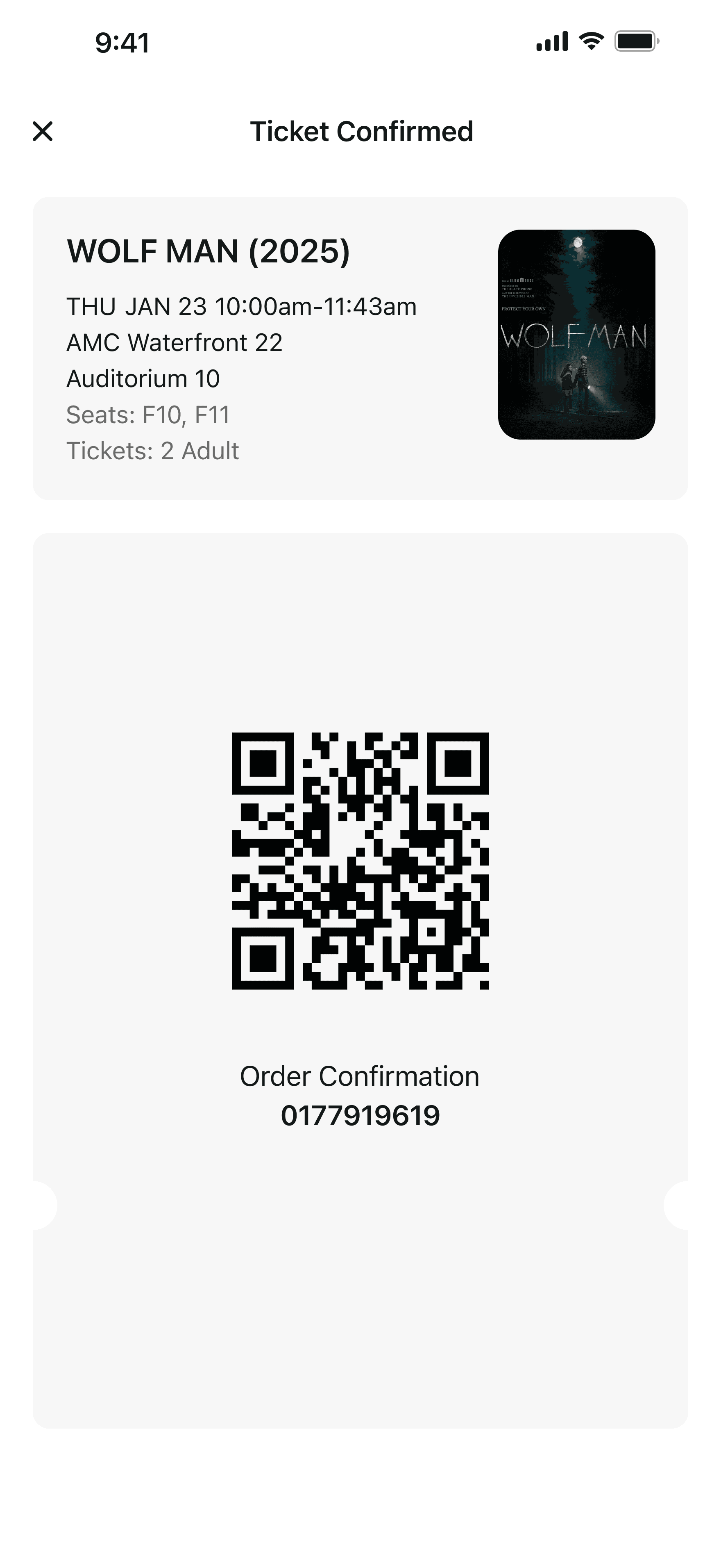
I designed two versions: one is more tailored to the Chinese market, with smaller images and more compact, information-dense layouts; the other leans toward the American market, featuring larger images and a simpler, more direct and rounded design style. However, both versions integrate elements from both Chinese and American design systems—while each has its focus, they both combine the strengths of the two approaches.
Version 1
Leaning toward the Chinese market


Version 2
Leaning toward the American market